online or offline.
Including this one.
Easy. What you see is what you get.
for unlimited rights,
with a single price.
ASAP. As Simple As Possible.
covers every project
from paper to pixel.
TTF, OTF, EOT, SVG, WOFF and WOFF2.
charitable causes and
nonprofit organizations.
Consider the font a small contribution.
-
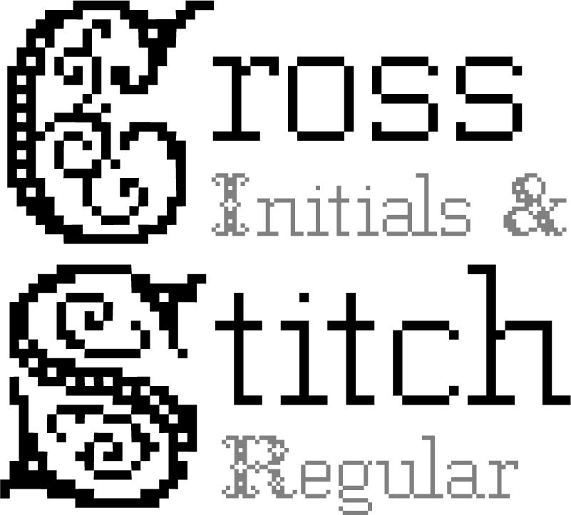
The Cross Stitch font is a digital remake of old embroidery templates from the 19th century.
Cross Stitch Initials.....................................................................................................................7.1
Cross Stitch Regular.....................................................................................................................7.2
Font updated on 21 April 2026page 7 -

Dry Brush is the Brush font “reloaded”, with more focus on the texture and the gesture, trying to get the maximum out of it.
Font updated on 12 May 2016page 9 -

Fashion Fetish initially was created to test the readability limits of a very light font on screen, but eventually this became a full font, with accents, symbols and special characters.
Fashion Fetish Light.....................................................................................................................10.1
Fashion Fetish Light Italic.....................................................................................................................10.2
Fashion Fetish Small Caps.....................................................................................................................10.3
Fashion Fetish Thin.....................................................................................................................10.4
Fashion Fetish Thin Italic.....................................................................................................................10.5
Fashion Fetish Regular.....................................................................................................................10.6
Fashion Fetish Italic.....................................................................................................................10.7
Fashion Fetish Outline.....................................................................................................................10.8
Fashion Fetish Bold.....................................................................................................................10.9
Fashion Fetish Heavy.....................................................................................................................10.10
Font updated on 4 October 2016page 10 -

Giant Gnome is an experiment with extreme weights and shapes, looking for a maximum impact on small sizes.
Font updated on 26 March 2025page 12 -

Gotcha Gothic is a personal approach to classics, created to have an extended option for headings, with lowercases, accents and iconography, not necessarily for web.
Gotcha Gothic Regular.....................................................................................................................14.1
Gotcha Gothic Italic.....................................................................................................................14.2
Gotcha Gothic I3D.....................................................................................................................14.3
Gotcha Gothic Volume.....................................................................................................................14.4
Gotcha Gothic Light.....................................................................................................................14.5
Gotcha Gothic Print.....................................................................................................................14.6
Gotcha Gothic Stamp.....................................................................................................................14.7
Font updated on 5 January 2017page 14 -

HighVoltage was designed as an alternative to important texts usually limited to caps letters, to have a similar, imposing effect in any circumstances.
HighVoltage Rough.....................................................................................................................17.1
HighVoltage Regular.....................................................................................................................17.2
HighVoltage Heavy.....................................................................................................................17.3
HighVoltage Heavy Rough.....................................................................................................................17.4
HighVoltage Light.....................................................................................................................17.5
HighVoltage Thin.....................................................................................................................17.6
Font updated on 9 May 2025page 17 -

As it usually happens, this font is an extension of a personal project, for which I needed only a few characters.
Legal Vandal Stencil.....................................................................................................................19.1
Legal Vandal Regular.....................................................................................................................19.2
Legal Vandal Stencil Bold.....................................................................................................................19.3
Legal Vandal Bold.....................................................................................................................19.4
Legal Vandal Stencil Heavy.....................................................................................................................19.5
Legal Vandal Heavy.....................................................................................................................19.6
Font updated on 27 March 2025page 19 -

Loveletter No9 was made for the love of letters, of course, using generous gestures in a complex and “romantic” design.
Font updated on 7 March 2018page 21 -

PostScriptum is based on a minimal construction and a very strict grid, with small weight variations and a condensed design that will result in a compact text, in every use.
PostScriptum Thin.....................................................................................................................25.1
PostScriptum Thin Italic.....................................................................................................................25.2
PostScriptum Light.....................................................................................................................25.3
PostScriptum Light Italic.....................................................................................................................25.4
PostScriptum Regular.....................................................................................................................25.5
PostScriptum Italic.....................................................................................................................25.6
Font updated on 16 May 2018page 25 -

Sugar & Vinegar is an old-fashioned font, with a “handmade” warm touch, avoiding sharp corners, grids or very strict guidelines, created with a fluid, personal and expressive line.
Font updated on 2 April 2025page 33 -

Type Machine is a font adjusted manually on each level, this way minor slips in line weights will only get the design closer to a handcrafted look.
Type Machine Light.....................................................................................................................34.1
Type Machine Regular.....................................................................................................................34.2
Type Machine Bold.....................................................................................................................34.3
Type Machine Heavy.....................................................................................................................34.4
Font updated on 3 May 2021page 34 -

The font was made using Windows95 titlebars as inspiration, redrawing each character pixel by pixel, at times when bitmap fonts were on every desktop, and not by choice.
Windows Outline.....................................................................................................................36.1
Windows Inline.....................................................................................................................36.2
Windows Monoline.....................................................................................................................36.3
Windows Dots.....................................................................................................................36.4
Windows Rounded.....................................................................................................................36.5
Windows Regular.....................................................................................................................36.6
Windows Bold.....................................................................................................................36.7
Font updated on 6 May 2019page 36